Cozy. Creative. Connected.
I’m Jackie—designer, stylist, and lover of all things cozy and creative. This blog is your go-to spot for simple tips, fresh ideas, and real-life design inspo to make your home feel just right. Let’s have some fun with it!


knoxville interior design
I’m Jackie—designer, stylist, and lover of all things cozy and creative. This blog is your go-to spot for simple tips, fresh ideas, and real-life design inspo to make your home feel just right. Let’s have some fun with it!
Choosing paint colors for your home can feel paralyzing—there are thousands of options, and you might worry about picking the wrong one or committing to something too bold. But as a designer, I believe color is one of the best ways to express personality in a space. It doesn’t have to be scary—it can actually be simple and even fun when you have a plan.
Whether you’re going for cozy and calm, bold and energized, or something in between, here’s my process to help you choose paint colors confidently and understand how everything else—furniture, accessories, lighting—works together to bring your space to life.
Before diving into swatches, ask yourself: How do I want to feel in this space?
Do you want your bedroom to feel serene and restful? Or do you want your living room to feel warm, social, and inviting? The mood you want will guide your color palette. For example:
Look at the colors you wear, the art you buy, or even what’s in your Pinterest boards. Often, people are drawn to the same tones over and over without realizing it. Hint: If you’ve ever had seasonal color analysis, often we are drawn to the colors that look best on us for our homes! It’s wild!
You don’t need to copy a Pinterest-perfect space, you just need to identify your preferences. I always encourage clients to trust their instincts. Color is personal, and your home should reflect you.
Choose a piece of art, a textile, or a rug as your inspiration and pull paint colors that are cohesive with this “North Star”. Remember a few key notes about paint and color if you want your room to look natural, collected, and designed but not forced.
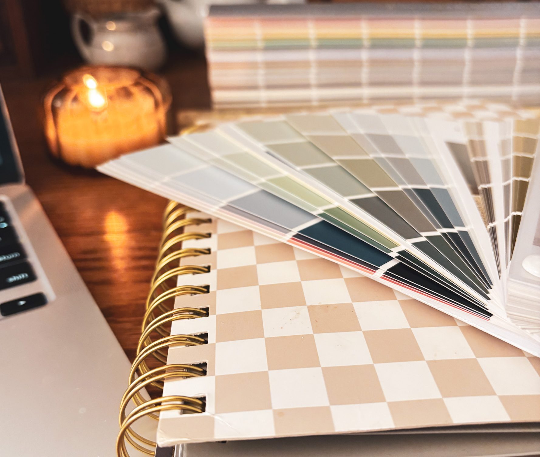
Always test your top 2–3 colors on multiple walls and look at them at different times of day. live with them for a while.
Instead of painting swatches directly on your wall (which can be messy and limit flexibility), use large sample boards you can move around. You’ll get a more accurate sense of the color, and you won’t end up with a patchwork wall.
Stick to 3 or fewer options—too many will just create decision fatigue.
But if you don’t listen to this piece of advice, I’m right there with you and you’ll see photos of my walls with 10 swatches painted in patchwork so don’t sweat it, we’re in this together.
Before I go to the next point, don’t forget paint dries darker because wet paint reflects more light. Let it dry before you judge. Once a color is all over your walls it will be darker, and more saturated than you thought from the paint chip or the sample. I PROMISE YOU. This is a universal truth. If it looks to desaturated on the paint chip, it might be just right!
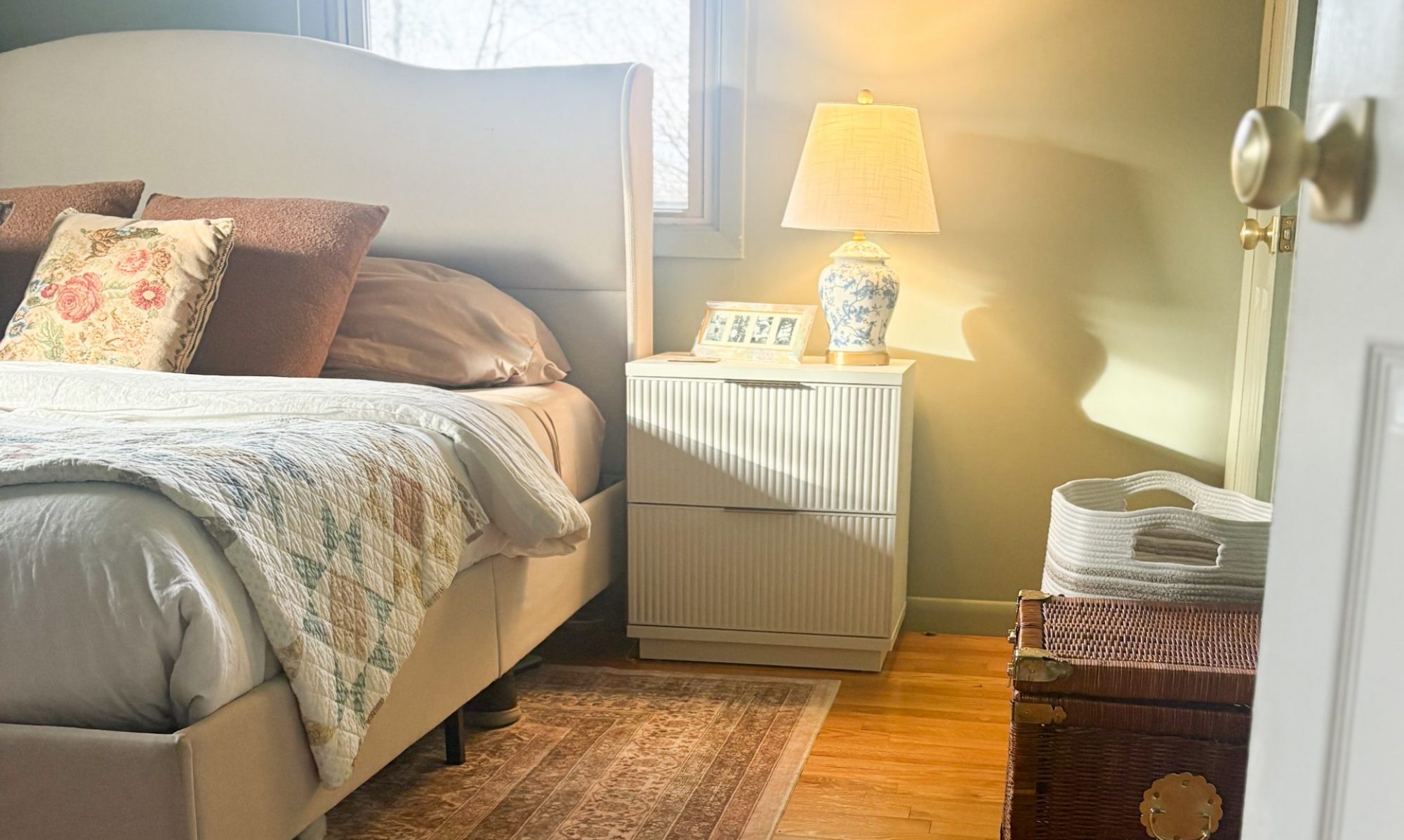
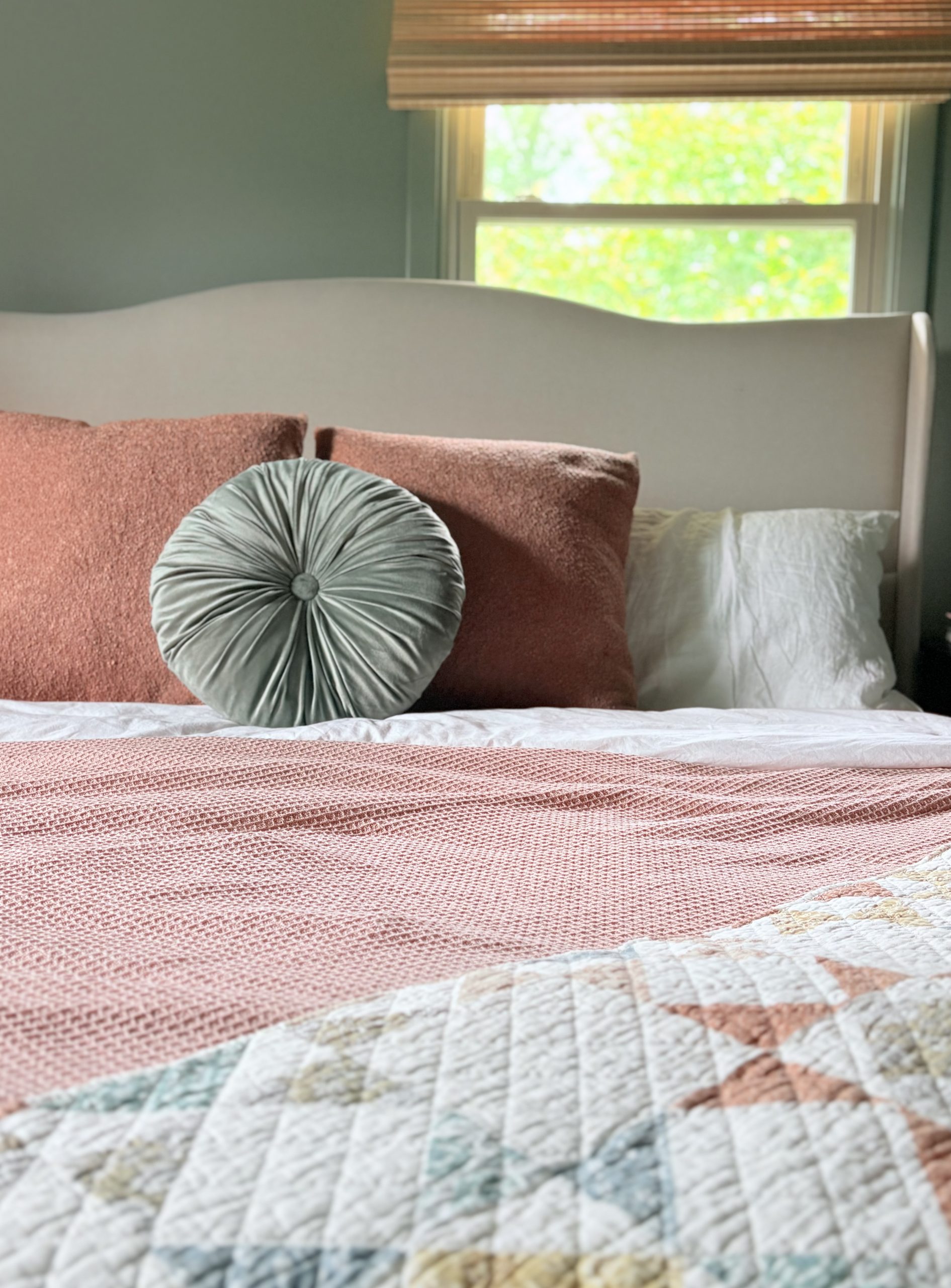
Here’s where people often get stuck: they think the wall color has to do all the heavy lifting. But in reality, color works best when it’s part of a bigger picture.
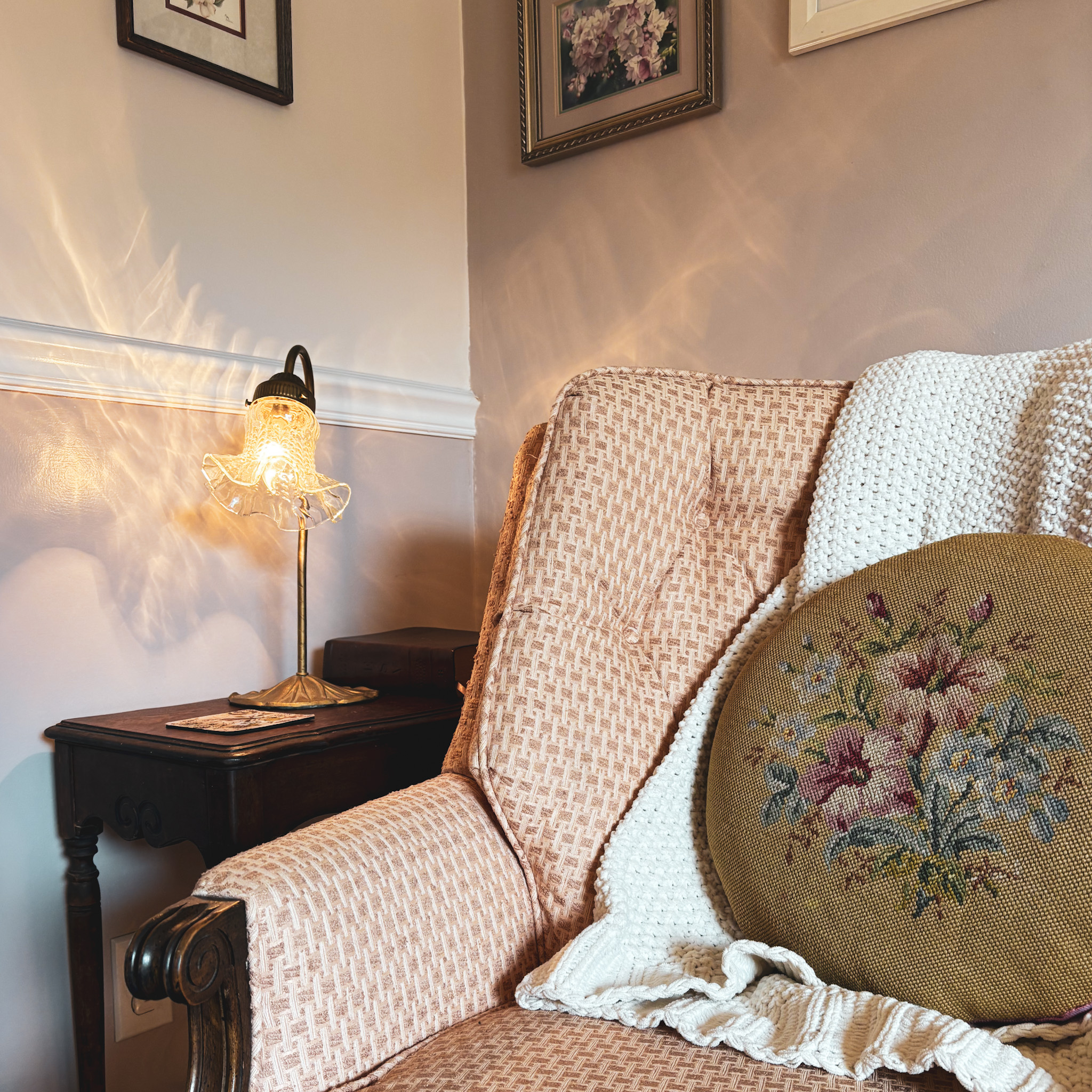
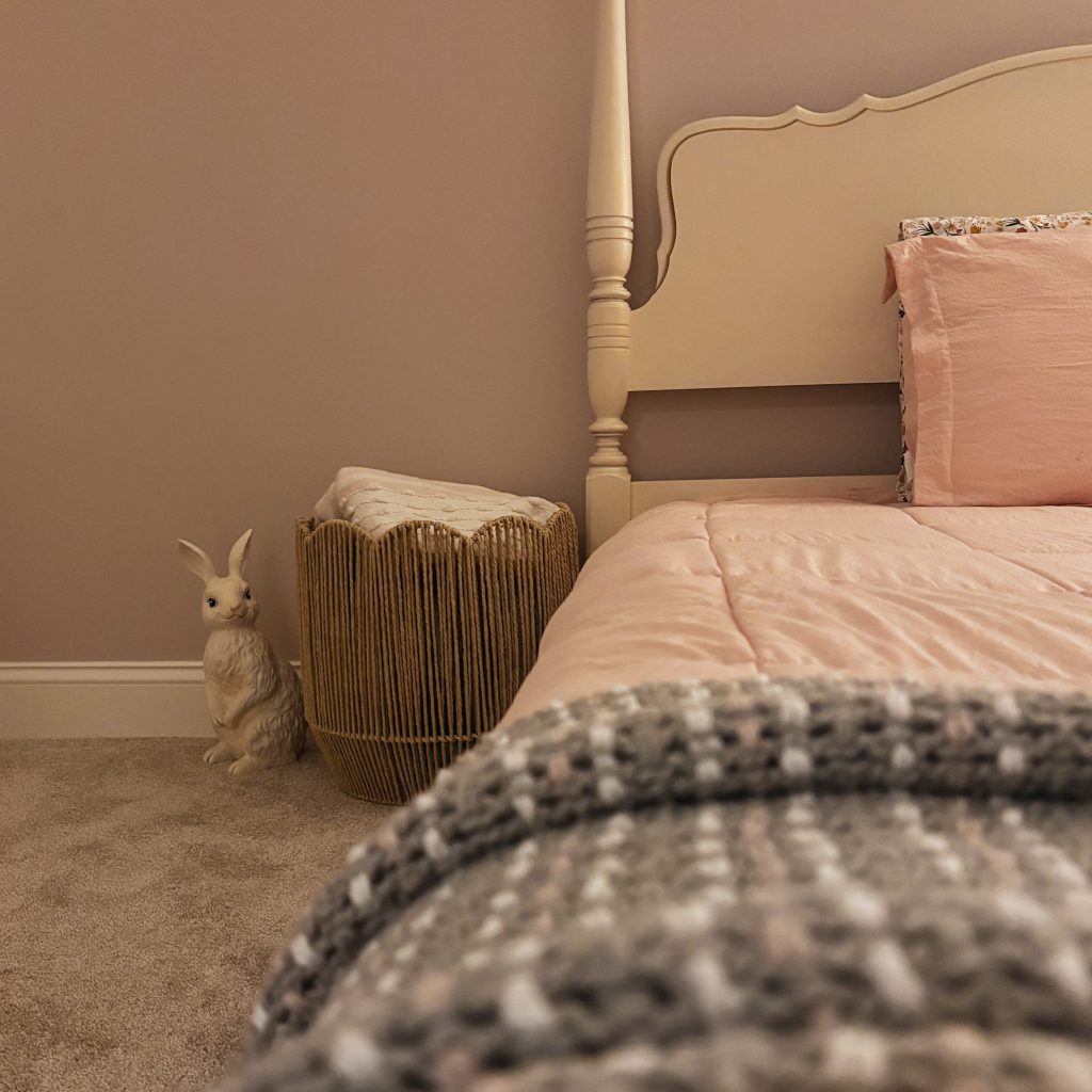
When I style a space, I look at how the rug, throw pillows, art, and even plants interact with the wall color. That’s when a color choice starts to feel intentional, and uniquely youugsru.
Choosing a paint color isn’t just a design decision, it’s part of how you shape the mood of your home. It’s about showing your unique personality, and connecting with others.
If you feel overwhelmed, know this: you don’t have to do it alone. Helping clients feel confident with color and creating spaces that truly feel like home is what I do every day.